Casa Dragones
Packaging Design
The overall shape for both the mid-tier and high-tier bottle came from research on architecture found in San Miguel de Allende. The neck shape came from the arches found in the entry ways to some of these historic buildings including the Casa Dragones headquarters.
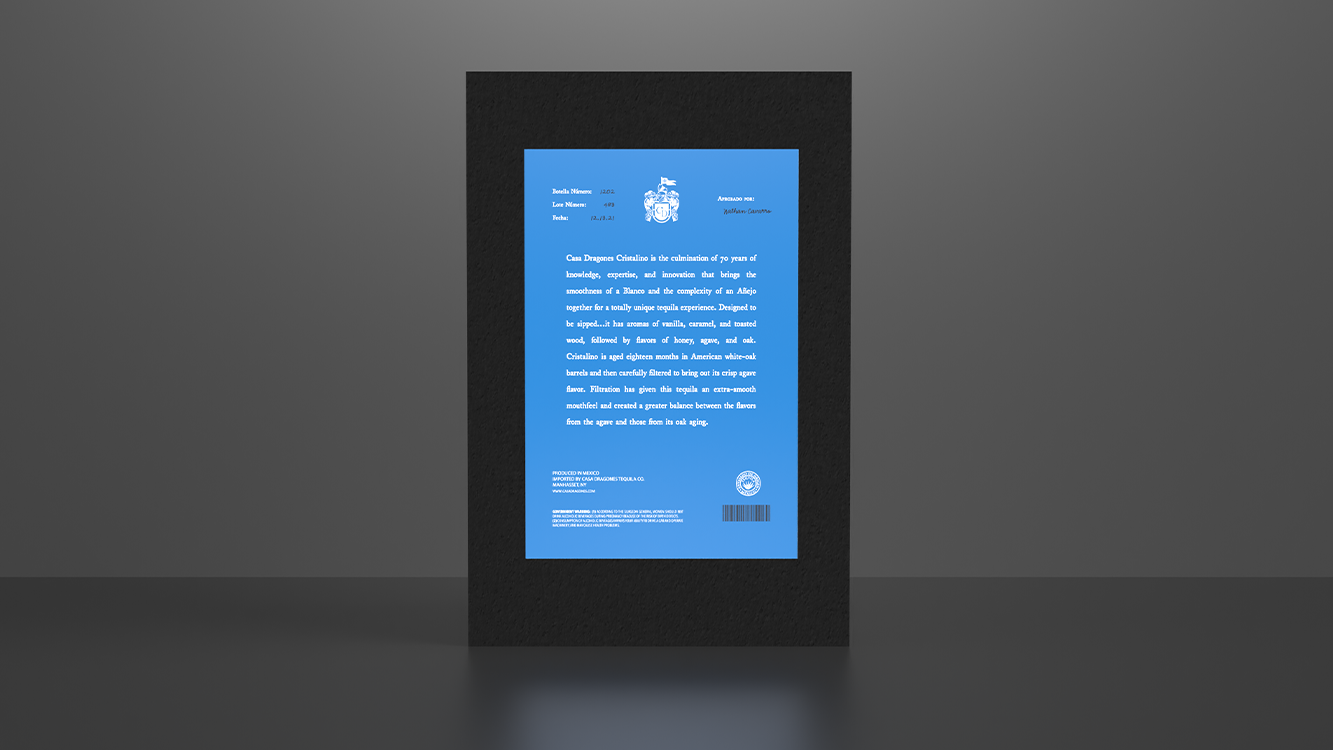
The label had to still represent the historical aspect of the Casa Dragones Brand. The representative blue color used on the labels is inspired by the same color of the military uniforms still worn to this day.
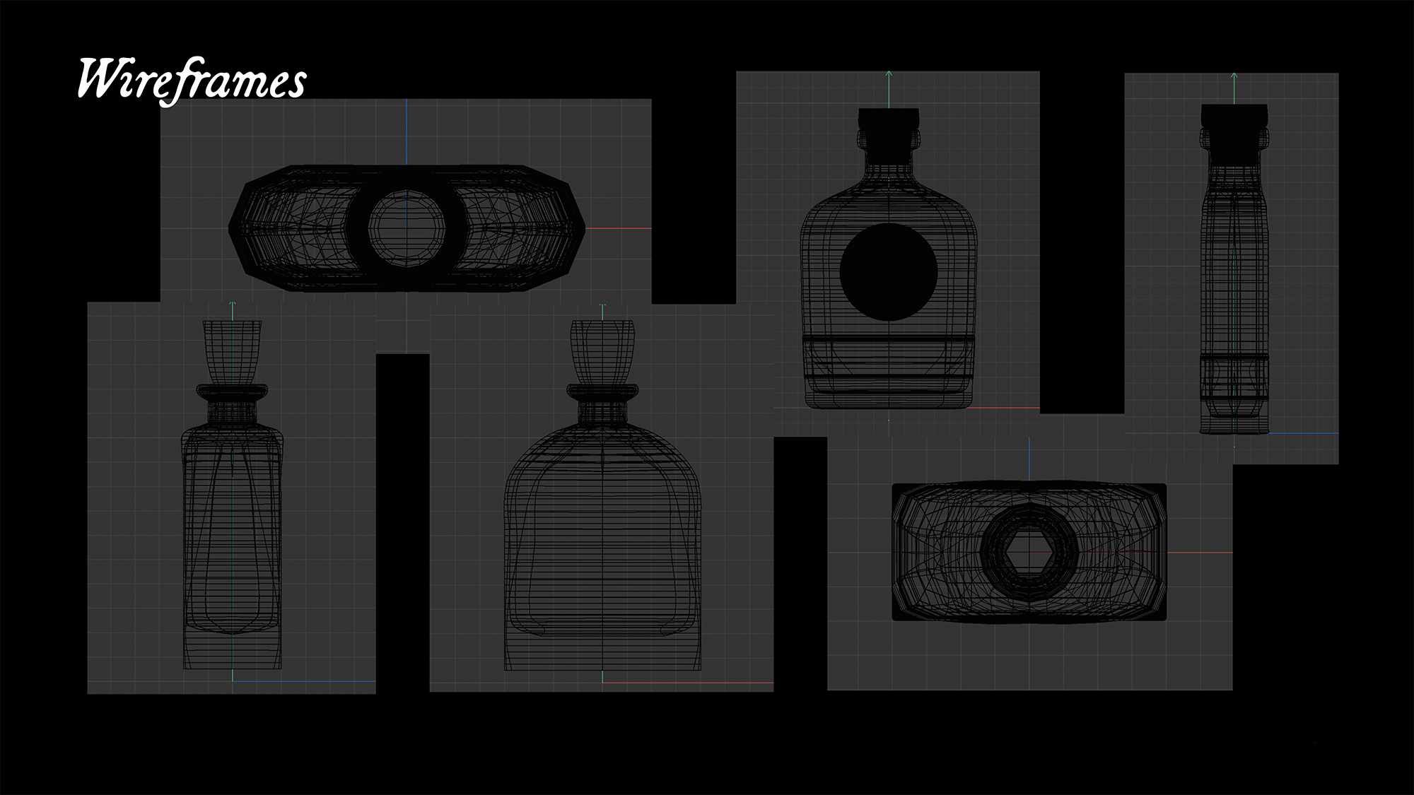
These are the wireframes that were created all using Cinema4D. They show different angles for each of the bottles.
This is the final label design that is used in the mid-tier and high-tier bottle.


